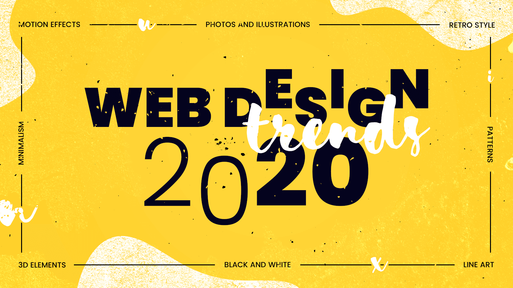
New year, new web design trends.
We are already starting to see some design elements that will be hot in 2020 (and maybe beyond). Most of these trending web design themes are continuations of things that have been building in design projects – more gradients, rule-breaking typography, and plenty of minimalism.
But there are trends that are emerging as well, such designs that feature “dark modes,” more interfaces with audio elements, and a big push for 3D images and elements.
Web Design and UI Trends to Follow in 2020
Minimalism + White Space
Minimalism is one of those classic design trends that just keeps going. (You could call it the Energizer Bunny of design trends.)
The best thing about this design trend is that while it stays strong, it continues to evolve. Minimalism in 2020 is marked by large swaths of white space. And not always in the place you would expect.
While Whiteboard has a more classic minimalist style – maybe even uber-minimalist – Soldo uses new minimalism beautifully. The simple photo is almost white and rests on a white background with asymmetrical white space to help draw users down through content.
Both examples show why minimalism works: They are elegant, beautiful, and easy to understand (making them highly usable).
“Dark Mode” Design
With so many users opting for “dark mode” on apps and for things such as email, it’s no surprise that more websites are also creating designs with a dark aesthetic. (Users have said they want and use it, so designers are delivering.)
What makes these dark mode designs to nice – and probably why they are trending – is that dark interfaces are complemented with bright accent elements and easy to read typography to ensure that the design is readable.
CanneSeries does it with almost-neon accent colors and animation with bold lettering, while Davenport uses white block letters and an elegant gold color for calls to action and other clickable elements.
Breaking Typography Rules
Almost every website you land on seems to include some form of animation. What’s really trending is liquid-style animation with movement that seems water-like.
Liquid animation can work for entire scenes as a way to transition video elements, as a hover state to entice clicks, or as a general animation the helps draw users into the design. The trick to making this trend work is in the speed of movement. It has to be smooth, fluid, and perfectly timed for the most realistic feel.
Toonami uses liquid animation as a hover state to bring extra motion to elements on the screen. The background video “liquifies” as does the block of text.
Ilya Kulbachny uses liquid animation for the headline of his portfolio website. (This might be one of the best uses of this design trend out there.) The words float on the screen and have an additional hover state that moves his image and the words even more.
Breaking Typography Rules
The key to making this design trend work is that even when breaking type rules – odd spacing, sizing, or even line spacing or breaks – the user still needs to understand what you want to say. Most commonly, typography in this style is more of an art element and less of an informational one.
J Powers Events breaks type rules in a way that doesn’t hurt readability with a main headline that crosses into the space of the background and a foreground image. What’s especially interesting here is that the type changes color with placement, creating a layer effect. The design also uses a round text element between background elements to connect the spaces.
Makers & Dreamers flips, turs, and twists typography in ways that you would not think of trying. Thanks to simple work choices and a clean overall design, the words are still somehow readable and the design comes together.
Liquid Animation
Liquid Animation
Almost every website you land on seems to include some form of animation. What’s really trending is liquid-style animation with movement that seems water-like.
Liquid animation can work for entire scenes as a way to transition video elements, as a hover state to entice clicks, or as a general animation the helps draw users into the design. The trick to making this trend work is in the speed of movement. It has to be smooth, fluid, and perfectly timed for the most realistic feel.
Toonami uses liquid animation as a hover state to bring extra motion to elements on the screen. The background video “liquifies” as does the block of text.
Ilya Kulbachny uses liquid animation for the headline of his portfolio website. (This might be one of the best uses of this design trend out there.) The words float on the screen and have an additional hover state that moves his image and the words even more.